I just sorta summarized it into pictures so you don’t have to go back and forth but i didn’t put the in depth meaning behind it so i still recommend checking the site out!!:
I’m only a self taught artist, no school or professional background so a huge disclaimer
I’m pretty sure most people knows the basics like neutral, primary, secondary and tertiary as well as subtractive primary colors (CMK) so I’ll skip through that along with the cold and warm colors:
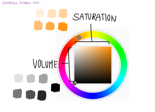
Volume and Saturation plays a big role on making palettes. It plays the part of the appeal and what colors to choose, palettes that are too saturated or high on contrast are quite painful to look at (some artist make it work by balancing it out so they still maintain the bright colors) and unsaturated, low on contrast palettes are dull to look at and not very a appealing.
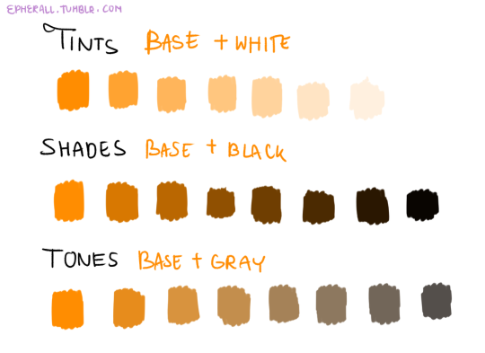
Tints, Shades, and Tones are sub terms you can use, this chart is to help you differentiate them
Now the fun part!!
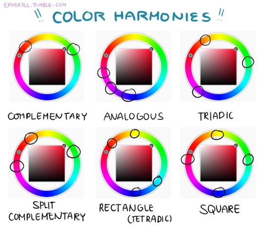
Color harmonies are basically techniques for choosing colors. Since SAI’s color wheel is kinda a disaster I recommend just looking up a color wheel on google or you can use this one here.